Flip Badge UX Issue Analysis
This section identifies a confusing UX behavior in Flip's mobile app related to the "Free Top-Up" badge.
Issue Screenshot
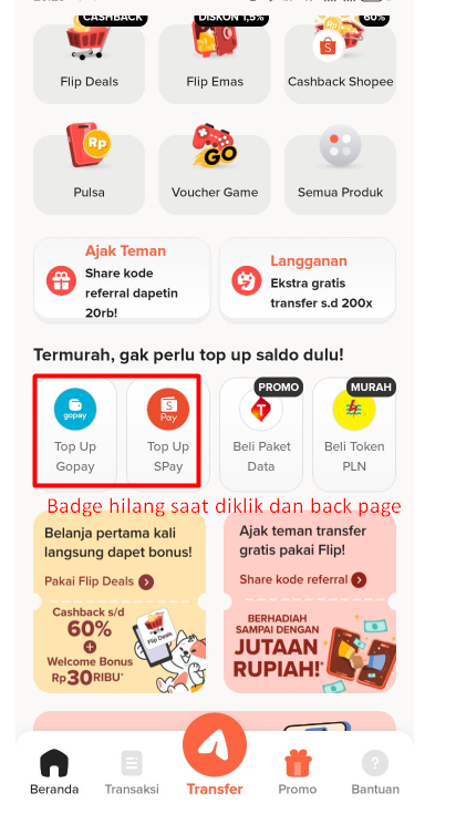
1. Problem
When users see a "Free Top-Up" badge on a balance top-up option, it appears clearly.
However, after clicking it and returning from the top-up flow (especially on mobile), the badge no longer appears.
Why it's confusing:
- Users may think the top-up is no longer free.
- It's unclear whether they need to pay or if the promotion still applies.
- The inconsistent visual feedback may reduce trust and cause hesitation.
2. Suggested Improvement
- Keep the badge visible after returning from the top-up flow, until the top-up has been successfully completed.
- Add a confirmation message:
"Top-Up is free. No fees applied." - Optionally, dim or animate the badge after it has been claimed to indicate it was used.
Why this is better
- Reduces user anxiety about hidden fees.
- Makes the top-up status clear and predictable.
- Improves trust and transparency, especially for promotions and free offers.
3. Severity
- Medium
- From a UX writing/interaction standpoint: misleading or disappearing badges affect user confidence, but the app functionality is not broken.
Tip for UX Designers
- Always maintain consistent visual cues for active promotions.
- Combine badges with textual confirmation to avoid ambiguity.
- Test the flow on both mobile and desktop to ensure state persistence.